


Colour my world
and a recipe for a salad with all the bright pretty things

It has come to my attention that we’re no longer having fun.
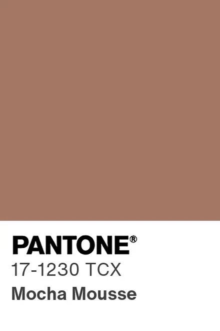
Amidst the complete train wreck that has been 2025 thus far, I missed the memo that the Pantone Color Institute’s Color of the Year is PANTONE 17-1230 Mocha Mousse…
…a warming, brown hue imbued with richness. It nurtures us with its suggestion of the delectable qualities of chocolate and coffee, answering our desire for comfort.
The Institute goes on to explain its process: “The Pantone Color of the Year program engages the design community and color enthusiasts in a conversation around color, highlighting the relationship between color and culture. Pantone selects a color each year that captures the global zeitgeist…a global mood and an attitude, reflecting collective desire in the form of a single, distinct hue.”
If the global mood is to feel shitty, I think they nailed the assignment.
Setting the tone
Back in the day, when I was an eager young retail executive, colour trends were my world. My favourite season? Autumn—always autumn. With its nubby fabrics, cosy-up outfits, layering options, and, most of all, its rich hues (and that fabulous “biggest issue ever” September Vogue), autumn fashion gives even the sartorially unsure a cornucopia of choice.
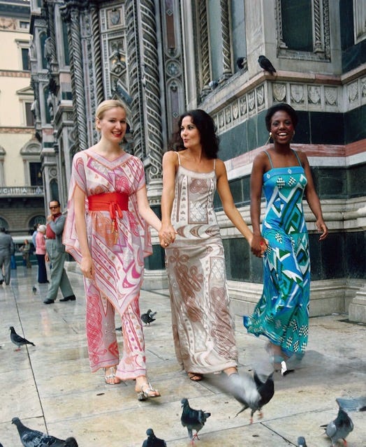
But no matter the seasons and my own personal proclivities, what I learned in those early retail years was that the pulse of the industry beat to the runways. If you wanted to know which colours would be everywhere next season, you looked to Paris—not Pantone. Long before Pantone decided that the world needed a Color of the Year, trends in everything from clothing and beauty to décor, design, and packaging were shaped by the fashion industry itself. Seasonal palettes emerged from the runways of couture and ready-to-wear designers, whose choices flowed into retail, interiors, and beauty.
Influential names like Yves Saint Laurent, Emilio Pucci, and Elsa Schiaparelli set the tone each season through their fabrics and signature colour stories. Behind the scenes, textile manufacturers and dye companies also played a critical role, presenting colour cards to fashion houses as much as 18 to 24 months in advance, based on dye chemistry, fabric innovation, and emerging market trends.
From shocking pink, chocolate brown, lime green and mustard yellow, what emerged was a rich palette of colours to suit every taste.
And yet here we are, in 2025, dressed like a collective bowl of café au lait.
Life’s rich tapestry
Beige, it seems, is the new bold. And it’s the particular domain of the ultra rich.
According to the New York Times, beige has become the preferred shade of the upper echelons. As one observer noted, the haunts of wealthy have “flocks of people cruising around entirely in cream or beige or off-white.” Forget big, bold colours that attract attention. Today’s luxury is served in tones of tea biscuits — or as artistic director of Ermenegildo Zegna Alessandro Sartori put it, “stylish, but not too much out of the perimeter of being noticeable.” Apparently, the richer you are, the less you want to be seen.
Enter Mocha Mousse, stage left.
Revel in your own personal luxury. With a subtle elegance and sensorial richness, PANTONE 17-1230 Mocha Mousse empowers you to create moments of luxury that may be intimate in scale but can extend a sense of indulgence throughout the day.
Pantone website
I’d much rather go back in time to 2023, when the Color of the Year was PANTONE Viva Magenta 18-1750.
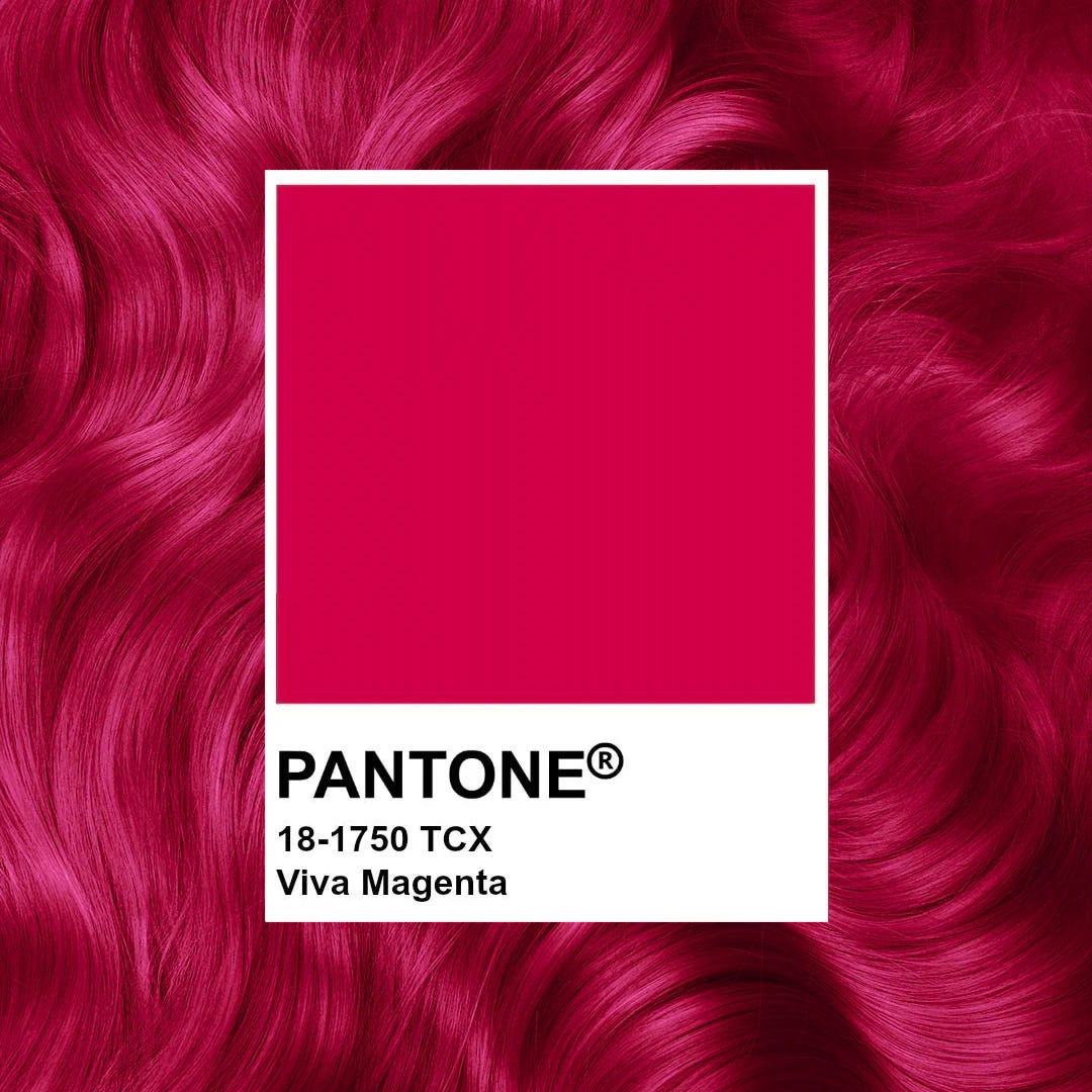
Viva Magenta is brave and fearless, and a pulsating color whose exuberance promotes a joyous and optimistic celebration, writing a new narrative. Viva Magenta is powerful and empowering. It is a new animated red that revels in pure joy, encouraging experimentation and self-expression without restraint, an electrifying, and a boundaryless shade that is manifesting as a stand-out statement. PANTONE 18-1750 Viva Magenta welcomes anyone and everyone with the same verve for life and rebellious spirit. It is a color that is audacious, full of wit and inclusive of all.
Wow!
Brave? Fearless? Writing a new narrative? Powerful and empowering? Audacious, full of wit and inclusive of all?
Count me in.
True colours
Consider this a palette cleanse.
Not just a break from beige, but a colour reset — a scrubbing away of safe choices, sand-hued sameness, and all the joyless minimalism we've been told to admire. I want colour that wakes me up, that shakes something loose. I didn’t fall in love with fashion because it whispered. I fell for it when it stormed the runway in marigold, magenta, or emerald green and made my heart race. Colour, in all its bold, unapologetic glory, is joy made visible. It tells the world who you are before you say a word. Why mute that?
I’m here to stand up for living life in full Technicolor, subtleties be damned. I believe in the power of the perfect red lipstick to turn any day into a celebration, a floral dress to create an instant party, and, most of all, colourful people to surround myself with. With tomato, corn, and peach season right around the corner, I’ll be eating my words before you know it.
If you enjoyed this post, click the ❤️ to let me know. It helps more readers discover Delicious Bits, and it means a lot to me. Thanks for reading — and eating — along.
A colourful summer salad
serves 4
When you're asked to bring a salad to a friend’s for lunch tomorrow, your best bet is to choose sturdy ingredients that can be quickly assembled just before serving. This salad is a mash-up of two of my favourite recipes that share similar ingredients, most notably crisp lettuce, fennel, and Parmesan cheese. To brighten it up, I tossed in green apple, sliced radishes, grapefruit segments, celery, red radicchio, Marcona almonds, golden raisins and a handful of fresh herbs. These can be prepped ahead.
The key? Make it easy, make it crunchy and make it colourful. Your mouth will sing and everyone will be happy.
Note: While you can prep some of these ingredients in advance, the fennel and apple will discolour, so it's best to prepare those just before assembling the salad.
Ingredients
For the dressing
1 small garlic clove, minced and mashed to a paste with 1/4 teaspoon salt
3 tablespoons fresh grapefruit juice
3 tablespoons white-wine vinegar
1 tablespoon Dijon mustard
½ cup olive oil
1 small shallot, minced
Handful minced fresh parsley leaves
Combine all the ingredients in a small Mason jar and shake vigorously to blend. This can be made ahead and stored in the refrigerator; bring to room temperature before using.
For the salad
Prep ahead the following:
6 cups coarsely shredded romaine
1–2 cups radicchio, thinly sliced as if for a slaw
2–3 radishes, thinly sliced
1 cup coarsely grated Parmigiano Reggiano cheese, or more to taste
1 large grapefruit, peeled with all pith and membranes removed, then cut into small bite-sized pieces
1 large celery stalk, thinly sliced
1 handful chopped fresh parsley
1 cup golden raisins
1 cup Marcona almonds
Prep just before combining salad:
1 large fennel bulb, cored, cut in half and thinly sliced
1 Granny Smith apple (or other firm apple), unpeeled, cored, cut into quarters, then into bite-sized pieces
Combine all the salad ingredients in a large bowl and mix to combine. Add the dressing to your liking, ensuring the salad is moistened throughout but not soggy. Finish with salt and pepper to taste.
Bright is the way to go. The ultra-wealthy will catch up with the trend eventually. And if they don't, so much the better. Let them wear beige!
Loving this fashion commentary and remember your colour-play very well! Often in the form of a fabulous scarf and always a bold lip.
I'm a neutral gal myself, so this pantone will guide me in my own love of all things fall (a knee-high boot! A covered neck!).
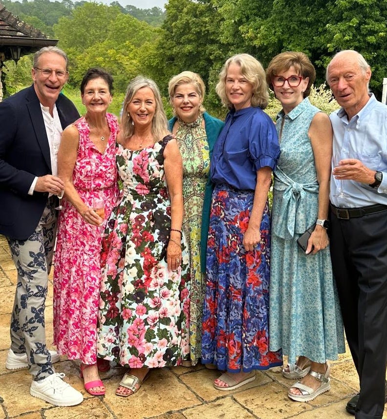
What a fabulous photo of faces I remember fondly. That must have been a wonderful gathering. I've often thought of trying to organize a reunion drinks for our team. Inspired! x